Dev Diary 1: Extreme Makeover, Mist Edition
- Intro
- Overview of the Dev Diary
- Dev Diary episode 1
- The Beginning
- The Long, Hard Process
- THE REVEAL — Mist’s New Look
- Next Episode
Intro
Over the past few months the Mist team has been relatively quiet on social media. Not a lot of actual game development updates have been posted. But there is a very good reason for this.
It was not the right time to release updates, show development videos and screenshots, or anything else. Market conditions were not right, and remaining token vesting was a factor as well.
But now the time has come.
We will begin our first Dev Diary episode by going back in time 3 months, to August. At that time, the Mist team decided to fully re-imagine and transform the game. We have been working on this new visual style, redesign, re-build, and much more over the past months, and we think it is time to finally begin the release of our work.
We will release a Dev Diary episode weekly or a few times a week, and each diary will summarize about 14–20 days of development time. We will start from August of this year, and will catch up to our current developments quickly. After we get everyone caught up with our past developments, the Dev Diary will be a real-time series with work that we are working on at the current time.
Overview of the Dev Diary
This Dev Diary series will take you into the very minds and bodies of our development team. You will see the work they have been doing, the reasoning for their work, and you will even get some insight on their thoughts while doing the development.
This series will begin by taking us back 3 months (to August of this year), and we will begin by sharing development process beginning 3 months ago. Note that the screenshots and videos we share will start from 3 months ago, and we will progress to the current day quickly. We want to share things from the past first, so the community gets an idea of where the team started, and how far they have come. Remember, these first screenshots will be from 3 months ago! A lot has changed since then.
Over the past few months the team has been grinding behind the scenes. Working on so many aspects of the game, ranging from full-game graphics makeover, to redesign of assets in the game (all custom!), to re-developing the very core of the gameplay such as character controllers, spell systems, and more.
Environment design was in progress as well. With the new graphics upgrade, they have all been re-designed to look sleeker, more custom, and more immersive.
Many new systems were also developed and put in place. From multiplayer networking, to spell coordinate systems, to potential mobile integration, and more.
There are also a few HUGE surprises that we will be releasing during this Dev Diary series, but they will come later in the series. Let’s just say that Mist will become much more customizable, accessible, and immersive.
Dev Diary, Episode 1
The Beginning
It all started with a vision. In November of last year (2020), blockchain gaming was non-existent. Nobody believed in it, and nobody knew it could be possible. But our team loved the idea of connecting the chain to a game. And it would allow people to earn tokens.
Back then, there were no games available. Nobody really knew you could play a blockchain game. And certainly, there were not 50 “games” coming out each day. Unlike today, these countless “card games”, “monster collectors” and more did not exist. And honestly, maybe it was better that way. We knew we could make an easy game, a card-game, or turn-based sort of thing. But we wanted to make a really quality, fun, immersive MMO RPG. It was a big undertaking but we were ready for it. We did not want to do a simple card-type game. We were going to make something great.
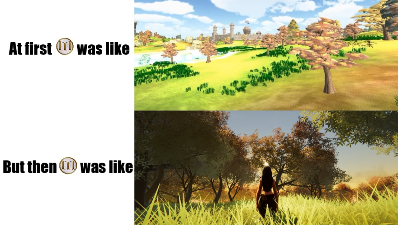
Originally our team decided to use low-poly character styles, and to use available assets from the Unity Asset store to make the game. The assets were available for use, and we really liked the asset packs. We thought we could use them to make a beautiful, fun game.
Of course an asset pack is not just “plug-and-play”, as there are countless hours of work involved to connect them to the game, to connect all the blockchain functionality, and more. However it really did speed up development time, and we were happy to use them.
Until the FUD came.
The team received continuous feedback about the assets. Some feedback was fair, but most of the feedback was uninformed and misrepresenting our process. The feedback ranged all the way to people claiming the project was a “fake” because we had used assets.
Either way, we listened to this feedback. Even after months of development in this low-poly style we decided to totally trash our original concept and bring out something new. It would involve MONTHS of additional dev time (during these past few months, that’s why we have been quiet), but we knew it would be necessary to deliver the type of game the community would appreciate.
I’ll say one thing: It is not easy to trash a whole project, to start fresh, after all of that work was put in. But we knew we had to do it.
We began a full attack on the new game:
- New graphics engine
-New stylized appearance
-Fully customized assets
-Fully customized new environments
-Full redesign of the game engine
-More, More, and More to come in future episodes of the Dev Diary
The Long, Hard Process
When beginning the style re-design process, we had to hire a few extra game developers and designers. We tasked them each to make a few different designs for the game, and to show us some possible re-design looks.
We knew we needed a more distinct, custom look. But that raised a lot of questions and we went through many weeks of testing, analyzing, re-designing, and analyzing again. This process cycle took a few weeks until we settled on exactly how we wanted Mist to look.
Some designs were more High-Definition. (Actually, High-definition is not technically more difficult to create. In fact, many times High-Definition games are much EASIER to create since you don’t need the artistic piece to make it more stylish). Although making a game high-def is the easiest option (yes, really), it ultimately did not work for us because it would be too difficult to load and play on mobile devices and lower-end computers.
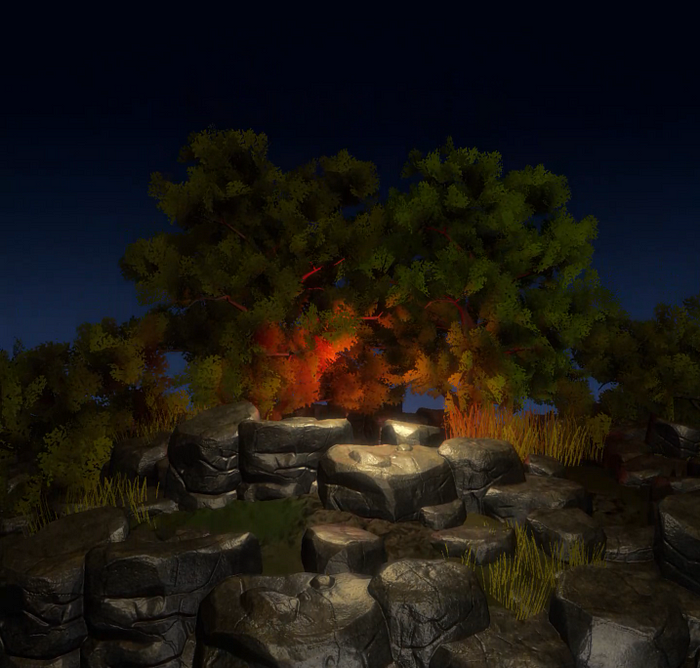
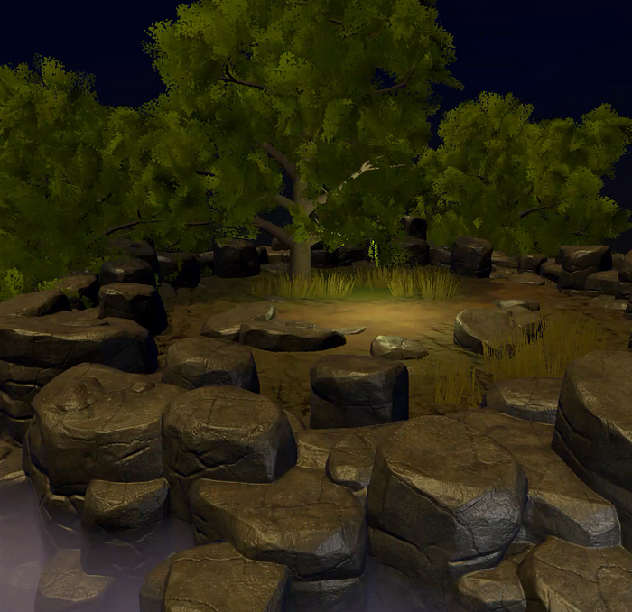
Part of this design we considered was a dark, stylized, more immersive style. This style had shadows that were much more prominent, and lighting played a much bigger role. This sort of style we considered for a long time, because like Diablo, it would allow players to immerse in the area closer to their character. Ultimately we chose not to go with this style because we wanted a more open-world, far-seeing design.
NOTE: All of these pictures are screenshots from our Developer’s videos. We tried each and ever one of these, and Mist could have looked like these pictures. Oh how funny life can be.
Other designs were more cartoony, and fun. They were more colorful and looked like they could be a totally different type of game. There were plusses to this sort of look as well. For example, it would be easier to play and load the game on mobile devices. However these styles we determined were a little bit too “cartoony” and “not serious enough”.

We also had a 4th style that we decided not to continue with. This style was also “cartoony”, but with different types of texturing and styling. We decided that this one was also not the exact style we wanted for Mist, as it was too ‘casual’ looking.

And then we got a design that we kind of liked (although we did make changes to it later). Originally this design kept that cartoony, colorful vibe, and mixed it with a more immersive style, that felt like an open-world game. The first editions of this style looked like this:


And after this, we began putting the finishing touches on the new look. Keep reading to see the final results.
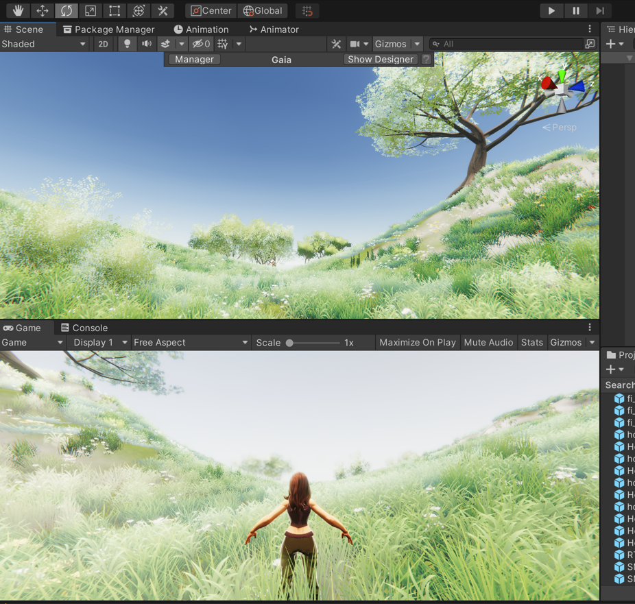

The first few steps included improving the lighting, the shadows, and the terrain geometry (note in some pics the character is still low poly. This has since been changed. The characters in the screenshots are asset placeholders. In Episode 4 or 5 of the Dev Diary we will release our new characters as well.).
THE REVEAL — Mist’s New Look


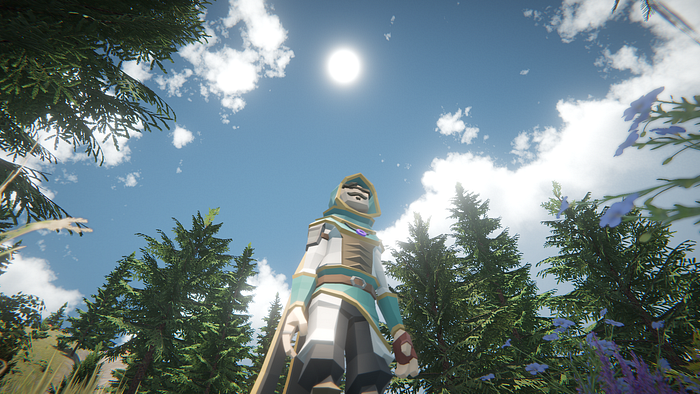
As you can see so far, we had to go through many weeks of testing to even find out which style we wanted the game to take. Our developers worked tirelessly to produce example scene after example scene (seen above) to show different potential styles. Finally, we found one that we liked the most.
We continued tweaking the shadows, shaders, view distances, lighting sources. We changed around the terrain designs, and we updated skyboxes and more.
The Final Product:

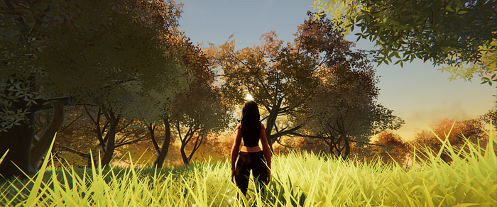

This style merges semi-realism with a colorful punch. It allows high field-of-view, long view-distances, while also allowing the game to run on mobile devices and low-end computers. Our end result was a beautiful piece of art, that was both playable, and visually appealing. So moving forward, we decided to use this art style for the game.

Totally custom, totally unique. Totally Mist.
We went ahead with this art style, and began the re-building and re-design process for all of our zones, caves, towns, characters, classes, assets, etc (all things we will cover in later episodes of the Dev Diary).
Next Dev Diary Episode:
In the next Dev Diary episode, we will talk about the progression and upgrading process for our first zone, Dunia.
We will show very very early screenshots of how the original Dunia looked (as far back as the early brainstorming phase!), and we will show the progressive updates and upgrades on it.


